Client Projects

Website Facelift


No Comments

Website Facelift

The largest freelance project I’ve taken on to-date is redesigning the Parts N More website. This e-commerce website (owned by MC Distributing) sells thousands of parts for vintage motorcycles. Their current website was created several years ago, and so they felt it was time to freshen up their look and give their website a facelift.

I tackled this project as not only a website facelift, but an entire rebranding. I wanted to give them a new identity that would help them stand out against competitors and modernize the look and functionality of their site. I wanted their new look to be strong and sleek, so I toned down their colour scheme by using a lot of charcoal gray and using teal blue as their main accent colour. I also wanted to add some photography of motorcycles to make the purpose of the website immediately known and to add some visual interest. I also redesigned their logo to reflect their new identity.

When designing websites, one always has to keep in the mind the user experience (UX) and the user interface (UI). The functionality of the website needed some tweaking to help simplify the UX. I kept the layout clean and simple, but changed how customers could find their products. Instead of having to go to 2 different pages before getting your search results, you can now filter through the bike year and model on the home page and be taken directly to your results page.

We also added some new key features to the site such as:

  •  a site-wide multi-currency  feature
  • a more obvious separation of custom fit parts and universal fit parts by creating separate sub-categories under each main product category
  • a pop-up window showing customers an item has been added to their cart, giving them the option to either continue shopping, view cart or check out
  • a full footer menu in addition to the header menu
  • an order history page with full order details
  • a simplified checkout option with PayPal
  • an order confirmation page
  • and mobile-friendly designs

I have designed all of the website pages in Adobe Photoshop and we’ll be ready to start development soon! (We’ll be working with the developer d3.)

This project has been the most satisfying experience for so many reasons. I not only love what I do, but I thoroughly enjoyed working with the lovely people at MC Distributing. This was also satisfying to create because at my last job I spent months designing a website for a similar industry that was never launched, so it feels like I might actually get some closure this time around! It’ll be exciting to get this website up and running after weeks of work, especially for the client. Stay tuned for the website launch details!

I’m already on to the next website redesign project for Nick & Dan’s Collision, but I am always taking on new clients. If you’re looking to create or upgrade your online presence, contact me for help!

Thanks for reading,

~ Manda Mac

Client Projects

Digital Drawing: Cartoon Creations


No Comments

Digital Artwork Flat Cartoon Design

Digital Drawing:
Cartoon Creations

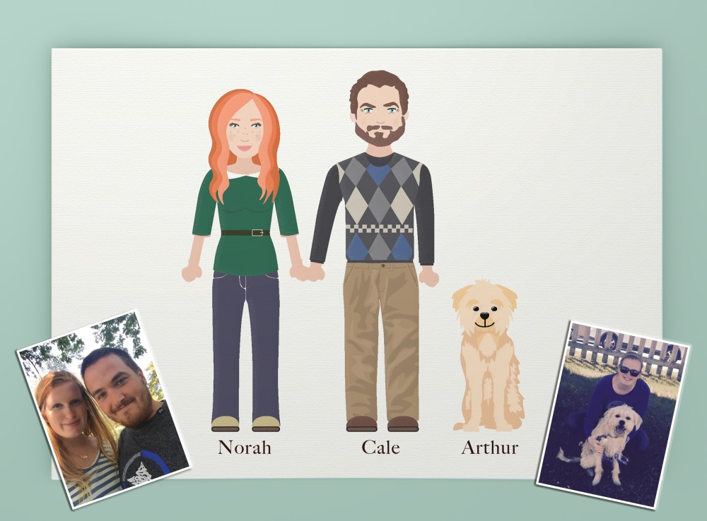
It’s ‘Toon Time! Who doesn’t want a cartoon version of themselves? These digital drawings are projects I really enjoy doing. I’ve always loved to draw; and learning how to apply that skill set to the digital world has been challenging and fun. A few months ago, some dear friends of mine made a request to get a digital family portrait created.

I used Adobe Illustrator to create this project, and used reference photos (shown above) to make sure my vector drawings resembled each person (and puppy!). The inspiration for this type of portrait was a flat, vector style which is a style I LOVE.

These type of digital drawings are fun to create, and fun for my clients to receive. I love the reactions I get when showing them their “cartoon selves”. They also make for great personalized gifts.

To see other styles of digital drawings I’ve done, check out an older blog post of mine from last year here.

If you’d love to have a digital drawing created, ya’ll know who to come to!

Love and lollipops,

~Manda Mac

Client Projects, Uncategorized

Roller Derby Dames


No Comments

Social media infographic flyer


Roller Derby Dames

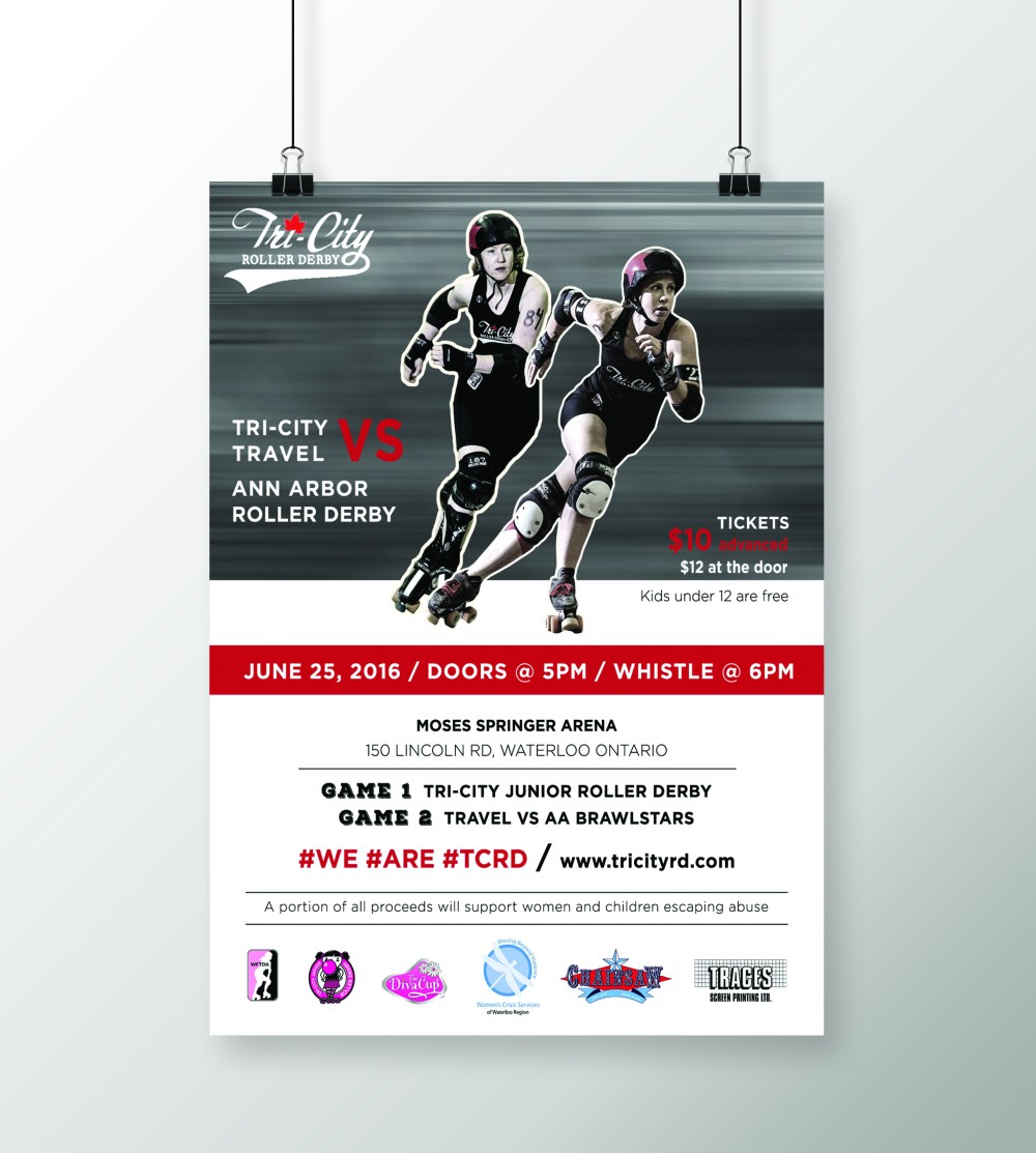
In terms of favourite clients to work for, I’m noticing a pattern of me being attracted to strong women…enter my next client: Tri-City Roller Derby.

Tri-City Roller Derby is a registered non-profit, all-women’s flat-track derby league. They’re based out of Waterloo, Ontario but face teams all across Canada and the U.S.

This league of women will be the first to tell you: this ain’t your momma’s derby. All the hits, blocks and spills you see on the track are real and un-staged. This isn’t just a show, but a hardcore sport.

They’ve asked me to create monthly event posters to advertise their games and events. These events survive off sponsors and ticket purchases, and in the case of this weekend’s event, a portion of all proceeds will go to Waterloo region Women’s Crisis Services.

So I get to create artwork for a group of strong, athletic women and also help support a cause that aids even stronger women seeking help?

I think it’s safe to say, I love my job.

Check out these ladies at tricityrd.com

….

Chicks Rule 🙂

Thanks for reading, guys!

~ Manda Mac


Client Projects, Inspiration

Standing Out with Laura Leyser


No Comments


Standing Out

With Laura Leyser

I was asked to create a promotional piece for Laura Leyser, the past president of the Canadian Real Estate Association. In addition to being an active REALTOR®, Laura is also a professional speaker. She delivers a high energy presentation all over the world to share her first-hand experiences in the real estate industry. Her presentation, Step Up to Stand Out, centres on how to stand out from the crowd and find success in real estate.

Anyone who has met this woman knows that she is a force to be reckoned with. She is a powerful, dynamic leader who has worked her whole life to get to where she is now. Her presentations are filled with knowledge, experience and strength and she needed a brand identity that reflected that. During these presentations, speakers typically have a slideshow as well as handouts to give out. Laura noticed that a lot of her peers had the same kind of handouts; a simple 8.5 x 11″ paper with a lot of text about themselves and their presentation. To stay true to her presentation, we needed to create something different to help her stand out.

The resulting design for her handout was a smaller, more convenient postcard to give out to listeners. This was much easier to hold on to and keep through out the day than a larger, 8.5 x 11″ paper. We wanted the card to be in full colour and to look professional. The content was kept short and to the point. On the front we have a small “resume” of her impressive capabilities as well as her contact information. On the back, a short “about me” section with a list of her titles and achievements. Her presentation slideshow was also created using this same brand identity; a dark, dramatic charcoal-grey background with elements of gold, and we used strong, structured typography. She also had some wonderful professional photographs to work with which can make all the difference when putting together a promotional piece like this!

Working with a fearless, independent leader like Laura was not only a wonderful learning experience, but inspiring as well. It was an honour creating a brand to suit such a powerhouse.

Chicks Rule.

~ Manda Mac

Client Projects, Inspiration

Making Admail Fun


No Comments


Making Admail Fun

About two months ago I was asked to create some admail postcards for Abbax. Abbax is one of the most progressive providers in North America for Cloud services, serving clients across the globe. While I was happy to take on the project, admail (also affectionately referred to as “junk mail”) can be challenging to create for several reasons.

  1. It’s referred to as JUNK mail…so the typical consumer response to receiving this type of mail is to immediately throw it in the trash. You need to try and design something that will catch their eye long enough to NOT throw away.
  2. You want your card size to be small for lower printing costs and convenient mailing purposes. But a small card size can create challenges for designing the layout when wanting to add a lot of information and graphics to a small amount of space.
  3. Defining your message can be difficult. Due to the above two reasons, you need to identify  a short and to-the-point marketing message for your business and/or services. If you don’t have a lot of space for designing your layout, and you don’t have a lot of time for your consumer to consider your piece then you need to identify your core message and marketing goal, and create a minimal amount of text to communicate that message. Humans are very visual (and sometimes lazy!) creatures, we would much rather look at a picture than read a paragraph.

So to get started I did some research to understand the type of company Abbax is, their brand identity and the type of designs they currently use for their marketing pieces. Their website was modern, colourful and fun which appropriately reflects the company and what they do.

Screen Shot 2016-05-09 at 12.19.38 PM

I wanted to make sure the mailer designs matched the “look” of their company and so I used some of the bold colours that I found on their website and used similar icons to help communicate the services being provided. The purpose of these mailers was to market 3 different Abbax service bundles. Three slightly different designs were created to highlight each of the service bundles: “Fax and E-mailing services”, “Unlimited Calling” and “Storage and Backup”. I wanted the designs to look consistent across all 3 cards so I used the same colour scheme in different ways, only changing the location of the colours and the icon designs for each card. Each mailer had the same design on the back of the card which listed all of the services provided.

While these projects can sometimes be on the boring side and tiresome to create…this project was a lot of fun to design and both the client and I were super happy with the result. Using fun icons and bold colours can really help make a design eye-catching, but I personally feel it also makes designing more enjoyable. Junk mail doesn’t have to be so boring!

If you or your business are in need for marketing mail pieces, e-mail me at manda.mac.design@gmail.com

Thanks for reading!
~ Manda Mac