Adobe InDesign

Client Projects

It’s Derby Time, Ladies!


No Comments

Social media infographic flyer

It’s Derby Time, Ladies!

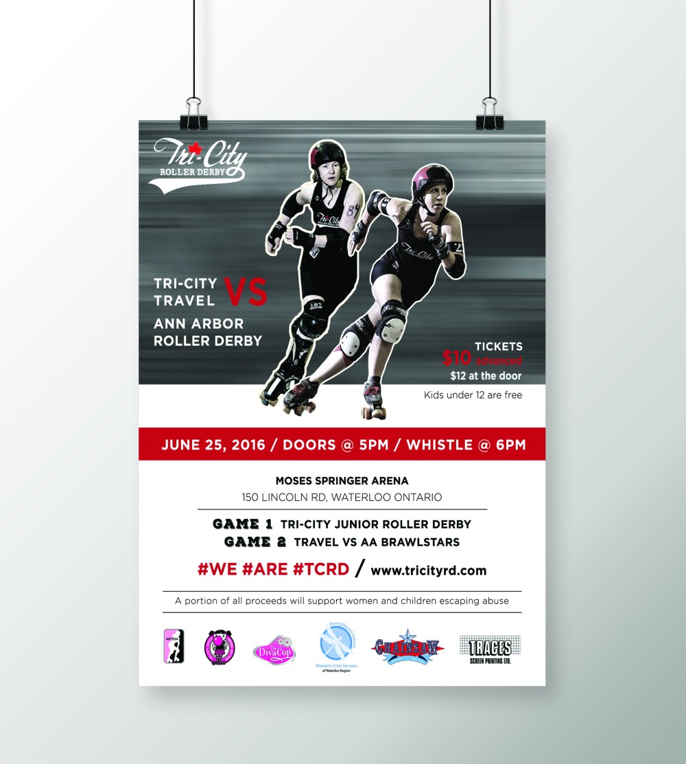
It’s that time of year again where I get asked to make an event poster for Tri-City Roller Derby. This is my second time making a poster for them and needless to say, it’s my new favourite project to do.

This time around, the poster is for their main event: the championship games. Killer Queens are playing Violet Uprising for 3rd place, while Venus Fly Tramps are up against Vicious Dishes for 1st and 2nd place.

I wanted the poster to have a rough, grungy feel while using clean and structured typography. Add some bad-ass, derby babes for the focal point and a dash of pink and we have ourselves a bitchin’ poster.

I used the same design and adapted it to create a Facebook cover ad as well.

pinkderbyfbcover

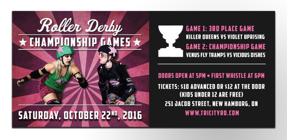
Photography was supplied by Joe Mac. Check out his Facebook page for more Derby photos.

Good luck to all the ladies playing, and thanks for letting me create another piece for you!

~ Manda Mac

Client Projects, Inspiration

Creating Rustic Wedding Stationary


No Comments

hollyweddingstationarymockup

Rustic Wedding Stationary

I had the pleasure of creating several pieces of stationary for the wedding of Holly and Tyler Graham that took place earlier this month. This bride knew exactly what she wanted, and lucky for me, she has great taste. It was a lot of fun working together and it always feels great to help a client’s vision come to life.

The design through out all of her stationary pieces was consistent: rustic and simple, letting the fun font choices be the main focal-point of the design. The pieces I created for Holly included the wedding invitation, program, menu and monogram.

I created a vector line-map of the ceremony and reception locations for the back of the Wedding Invitation, as well as a few vine graphics to use through out all of her pieces.

The pieces were printed on a rustic, cardboard stock and the wedding invitations had rounded corners. They printed beautifully and I was thrilled to see another happy client.

Thanks for choosing me to help bring your ideas to life, Holly!

For anyone interested in having a custom made invitation or other stationary piece, don’t hesitate to contact me.

Thanks for reading!

~ Manda Mac


Client Projects, Uncategorized

Roller Derby Dames


No Comments

Social media infographic flyer


Roller Derby Dames

In terms of favourite clients to work for, I’m noticing a pattern of me being attracted to strong women…enter my next client: Tri-City Roller Derby.

Tri-City Roller Derby is a registered non-profit, all-women’s flat-track derby league. They’re based out of Waterloo, Ontario but face teams all across Canada and the U.S.

This league of women will be the first to tell you: this ain’t your momma’s derby. All the hits, blocks and spills you see on the track are real and un-staged. This isn’t just a show, but a hardcore sport.

They’ve asked me to create monthly event posters to advertise their games and events. These events survive off sponsors and ticket purchases, and in the case of this weekend’s event, a portion of all proceeds will go to Waterloo region Women’s Crisis Services.

So I get to create artwork for a group of strong, athletic women and also help support a cause that aids even stronger women seeking help?

I think it’s safe to say, I love my job.

Check out these ladies at tricityrd.com

….

Chicks Rule 🙂

Thanks for reading, guys!

~ Manda Mac


Client Projects, Inspiration

Standing Out with Laura Leyser


No Comments


Standing Out

With Laura Leyser

I was asked to create a promotional piece for Laura Leyser, the past president of the Canadian Real Estate Association. In addition to being an active REALTOR®, Laura is also a professional speaker. She delivers a high energy presentation all over the world to share her first-hand experiences in the real estate industry. Her presentation, Step Up to Stand Out, centres on how to stand out from the crowd and find success in real estate.

Anyone who has met this woman knows that she is a force to be reckoned with. She is a powerful, dynamic leader who has worked her whole life to get to where she is now. Her presentations are filled with knowledge, experience and strength and she needed a brand identity that reflected that. During these presentations, speakers typically have a slideshow as well as handouts to give out. Laura noticed that a lot of her peers had the same kind of handouts; a simple 8.5 x 11″ paper with a lot of text about themselves and their presentation. To stay true to her presentation, we needed to create something different to help her stand out.

The resulting design for her handout was a smaller, more convenient postcard to give out to listeners. This was much easier to hold on to and keep through out the day than a larger, 8.5 x 11″ paper. We wanted the card to be in full colour and to look professional. The content was kept short and to the point. On the front we have a small “resume” of her impressive capabilities as well as her contact information. On the back, a short “about me” section with a list of her titles and achievements. Her presentation slideshow was also created using this same brand identity; a dark, dramatic charcoal-grey background with elements of gold, and we used strong, structured typography. She also had some wonderful professional photographs to work with which can make all the difference when putting together a promotional piece like this!

Working with a fearless, independent leader like Laura was not only a wonderful learning experience, but inspiring as well. It was an honour creating a brand to suit such a powerhouse.

Chicks Rule.

~ Manda Mac

Client Projects

Booklet Basics


No Comments

Booklet Basics

Hello strangers!

It’s been a while since I’ve updated my site with new projects so I thought I’d get back into the habit of posting. One of my favourite projects from the last year was a booklet I designed for Nested Birth & Essentials (offering Doula services and essential oils). It was a 5″ x 7″, 30-page informational booklet that included safety tips, recipes, guidelines and general information about essential oils.

It was really fun getting to create the colour scheme for this type of business. I wanted to use warm, inviting colours but still wanted it to look fun and colourful. I also incorporated some elements in gold (which is very trendy right now) and it added a fun punch of colour and shine. I tried to keep the layout very image-heavy when possible so that customers weren’t overwhelmed with text on every page.

Overall it was a ton of fun to create and I love getting asked to do booklet designs. If you have a business that could benefit from this type of marketing piece send me an e-mail at manda.mac.design@gmail.com

Thanks for reading!

~ Manda Mac